How to Use Color Theory to Create A Beautiful Instagram Aesthetic

One of the biggest benefits of promoting your business on social media is that you can use visual content. Platforms like Instagram excel at this, making it much easier to connect to your audience.
With over 300 million Instagram users, many companies use social media advertising to promote their brands through the platform. However, many companies also fail to develop a successful esthetic for their work on Instagram.
By embracing the power of Instagram marketing, you are helping to create an omnichannel marketing strategy for your business that celebrates your audience where they already are and provide a more personalized user experience.
However, to pull off Instagram growth successfully… One must master the Instagram game and develop a killer Instagram esthetic that actually catches the eye of your ideal customer. When done right, you can greatly improve your Instagram content. Here is how to use color theory to create a beautiful Instagram esthetic.
What Is Color Theory?
Color theory is a concept that helps designers combine colors for the best effect. Every time designers choose color palettes or pick colors for a project, there is some element of color theory involved in it. The colors you choose greatly affect how your content is received.
Color theory is divided into three distinct components that make it easier to analyze and choose colors. These components are:
-
Color wheels
-
Color harmony
-
Color context
Each component highlights a different aspect of color theory and makes it easier for designers to put colors together in a way that makes sense. If you want your Instagram posts to be more effective and look better, start by understanding the parts of color theory.
The Color Wheel
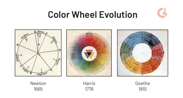
To make a logical color structure, designers turn to the color wheel. It is a collection of colors organized by how they relate to each other. By organizing colors into a wheel pattern, much like a pie chart, these connections become more obvious.

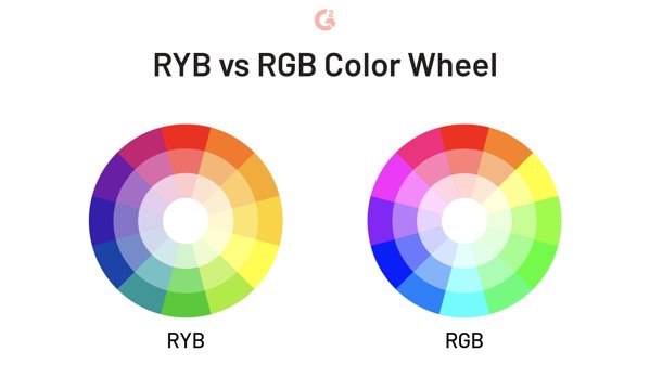
The most basic color wheel begins with six colors. Starting from the top and going to the right, these colors include:
-
Red
-
Orange
-
Yellow
-
Green
-
Blue
-
Purple
Related colors appear next to each other. For example, the warm colors (red, orange, and yellow) are next to each other on one side of the circle. The cool colors (green, blue, and purple) are on the other side of the circle. As you go around the circle, the colors blend from warm to cool and back.

The color wheel can be extended indefinitely to include any colors that you need. Professionals use it all of the time to make choosing colors much easier since it gives the colors a basic organizational structure. By applying different rotational techniques to the color wheel, it is possible to find colors that complement or contrast with each other, depending on what you are looking for.
Color Harmony
Color harmony focuses on how colors work together to create a pleasing experience. When colors work well together, they can enhance people’s understanding of your content. Colors that clash with each other can drive customers away or make your content hard to take in. If you want your content to be well-received and engaging, then it is important to use color harmony appropriately.
Finding colors that work together is actually pretty simple. The key is that you have to know the formula, or which formula to use. Painstaking research shows that there are specific algorithms to use based on the color palette that you are looking for. Here are a few examples that are used on a 12-part color wheel.
Analogous Colors
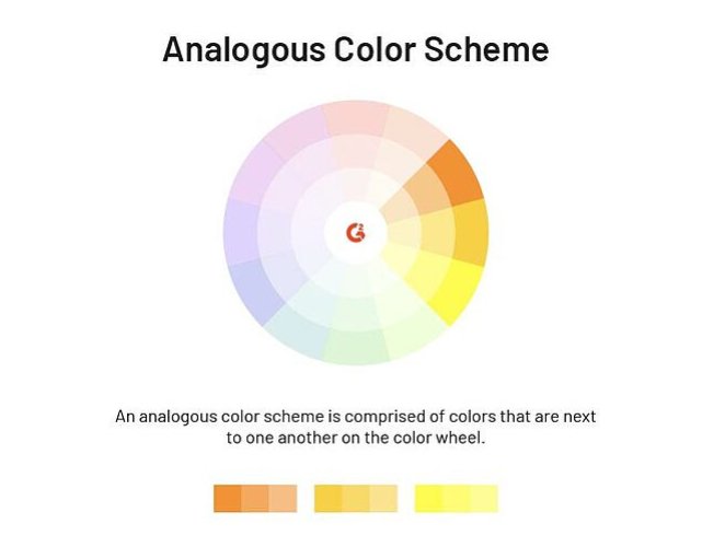
One of the easiest algorithms to use is the analogous colors algorithm. It chooses three colors that are located next to each other on the color wheel. Using these colors gives your content a more homogenous feel, like everything is a part of one thing with varying shades of color rather than separate colors.

[
View this post on Instagram
](https://www.instagram.com/p/BckWQO0ngqW/)
A post shared by Winsor & Newton (@winsorandnewton) on Dec 11, 2017 at 8:04am PST
Analogous colors often work best when used on single images that focus on one key point. It offers a low amount of contrast within the image, but also gives you greater control over fine details that blend well. Use analogous colors on complex images or content that needs fine details that don’t need to stand out. It will let viewers spend more time enjoying the image rather than deciphering what the content is about.
Complementary Colors
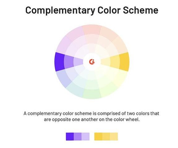
The alternative to analogous colors are complementary colors. Complementary color algorithms choose colors from opposing sides of the color wheel. You begin with a primary color, then rotate to find a secondary color. You rotate one more time to find a tertiary color to complete the color palette.

[
View this post on Instagram
](https://www.instagram.com/p/BzqVqsplUvf/)
A post shared by Monica Suzanne Escamilla (@fotomon83) on Jul 8, 2019 at 8:54am PDT
When working with complementary colors, you get a high amount of contrast. This is because the colors are in different sections of the color wheel that conflict with each other. It is possible to use a two-color palette to increase the contrast to its maximum. However, a three-color palette is more common to ease the contrast a bit. Since complementary colors create high contrast, use them when you have information that needs to stand out in your work.
Monochromatic and Random Colors
It is entirely possible to choose a color palette based on a single color. This is a monochromatic color palette. While it only uses one color on the wheel, it also uses multiple shades of that color to create enough contrast for fine details. It is similar to analogous colors but gives you an even more homogenous look. It should only be used in special circumstances as it can make content more difficult to take in if used improperly.

[
View this post on Instagram
](https://www.instagram.com/p/BzqxTJxpz-c/)
A post shared by Jess Marie MUA (@pinkcaliflower) on Jul 8, 2019 at 12:56pm PDT
Random colors represent the most common color palette in nature. You can often find two or three colors within the same natural items that are placed at random intervals around the color wheel. Flowers often do this, as they can have petals, stems, fruits, and other parts that are scattered across the wheel. You can use a random color palette in your work, but make sure that the colors work well together by choosing colors that make the important parts of your work stand out.
Color Context
Color context is the most difficult part of color theory to work with since it can be both factual and subjective. It deals with how colors work together when different color objects are placed together. This is important because your Instagram posts will often have layers of objects in them, and how their colors work together determines how the image is viewed.
For example, you can have a red headline. The background that you put it on changes how your headline is viewed. A brighter background can wash out the color while a dark background can help it stand out. Certain colors interact with other colors, creating strange effects. If you can harness these effects, then they can be your secret weapon for making truly engaging content.
Conclusion
The content of your Instagram posts matters, but the use of color is just as important. You could have the greatest message in the world, but it is not worth much if no one reads it. If you want your content to be memorable and have an effect on your viewers, then experiment with how to use color theory effectively.
Author Bio: Levi Olmstead | Levi is the Manager of SEO and Community at G2.com. Outside of work he enjoys spending time with his dog Frodo on Lake Michigan, finding the best new dance spot in Chicago, and watching re-runs of King of the Hill. You can follow him on Twitter @levi_olmstead
Explore Free Creative Tools
Everything you need to make your photos stand out with our free photo editing tools
